Knowing the numbers for hunger and poverty can go a long way to helping us talk about the issues accurately and craft effective, forward-looking responses. For those who share with their congregation information about hunger and poverty, these numbers can also be helpful in putting together presentations or workshops.
There are several sources for data that are particularly reliable and useful[1]:
- The World Bank’s poverty report;
- The Food and Agriculture Organization of the United Nations’ (FAO) annual “State of Food Security” report;
- The US Census Bureau’s annual reports on poverty and income; and
- The US Department of Agriculture’s (USDA) annual “Food Security in the US” report.
We are still waiting for the release of the USDA’s report, hopefully within the next week, but already, the data are showing some troubling trends and some surprising shifts in understanding hunger and poverty.
Rather than litter this post with a ton of footnotes, the sources are summarized below.
Information and infographics about global hunger and food security come from:
FAO, IFAD, UNICEF, WFP and WHO. 2023. The State of Food Security and Nutrition in the World 2023.
Urbanization, agrifood systems transformation and healthy diets across the rural–urban continuum. Rome, FAO. https://doi.org/10.4060/cc3017en
Information and infographics about incomes in the United States come from:
Gloria Guzman and Melissa Kollar, U.S. Census Bureau, Current Population Reports, P60-279, Income in the United States: 2022, U.S. Government Publishing Office, Washington, DC, September 2023.
Information and infographics about poverty in the United States come from:
Emily A. Shrider and John Creamer, U.S. Census Bureau, Current Population Reports, P60-280, Poverty in the United States: 2022, U.S. Government Publishing Office, Washington, DC, September 2023.
Global Hunger
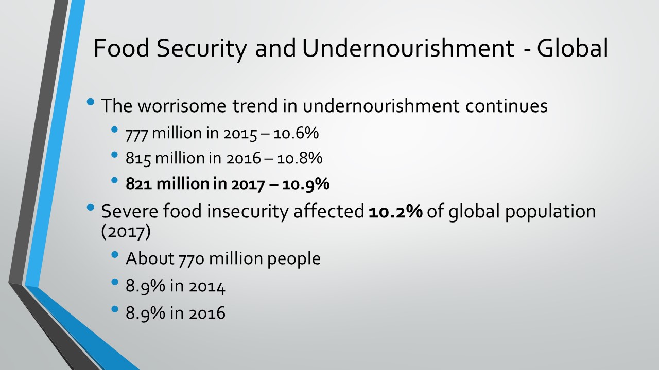
The first troubling trend in the data is that the spike in hunger we have seen in recent years has not eased. Hunger is still “far above pre-pandemic levels” (FAO, 2023, viii). In 2022, between 690 and 783 million people were hungry. If we look at the middle of this range – 735 million – we find about 122 million more people hungry in 2022 than in 2019 (613 million.) The prevalence of undernourishment, which is the measure the FAO uses to determine the rate of hunger, has increased from 7.9% in 2019 to 9.2% in 2022 – nearly 1 in 11 people around the world.
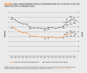
Prevalence and number of undernourished people globally, 2023 (FAO)
Fortunately, that’s come down a bit from 2021. There were about 3.8 million fewer people facing hunger in 2022 compared to 2021, but the number remains remarkably high. The rate of hunger in 2022 was a slight decrease from 9.3% in 2021, but still the highest rate since 2005. In some areas, especially Africa, Western Asia and the Caribbean, hunger continues to rise, in part because of reliance on more expensive exports.
We see even more concerning news if we turn to another measure the FAO reports, namely food security. While the prevalence of undernourishment measures long-term, chronic signs of hunger, the FAO also reports on food security, which is a shorter-term measure of people’s access to safe, nutritious and sufficient food year-round.[2] In 2022, 2.4 billion people were food-insecure, an increase of 391 million people since 2019, relatively unchanged from 2021. This means nearly 30% of people around the world cannot reliably access the food they need.
What is keeping hunger and food insecurity so high?
For starters, one critical factor is the war in Ukraine. The FAO estimates that, without the war, 23 million people would not have faced hunger in 2022. Another factor is rising costs. Food is more expensive, fuel is more expensive and incomes haven’t risen to match the jump in prices. Many countries at risk of hunger are dependent on exports. The “world food import bill,” which measures how much is spent globally on the import of food and food products, reached nearly US$2 trillion in 2022, the highest on record and an increase of 10% from 2021. This puts enormous pressures on importing countries and translates into much steeper prices for consumers. The cost for imports of agricultural inputs, such as fertilizer (a huge export of Ukraine, Russia and Belarus), was even more staggering – $424 billion in 2022, an increase of 48% from 2021. Put together, it’s more expensive to bring food in and significantly more expensive to produce food in-country.
One of the trends impacting hunger and the cost of food is urbanization. More and more people globally are moving into large cities or closer to cities. By 2050, nearly 7 in 10 people worldwide are expected to live in cities. The result of this shift, according to the FAO, is that the old framework of a rural-urban divide simply doesn’t match the world as it is. In general, as people move toward cities, their economic prospects grow, and their risk of hunger and poverty decreases (slightly.) The problem we are seeing now, though, is rapid urbanization without economic growth. While we used to think of hunger as primarily a rural issue globally, the data point us toward understanding the need to attend to a continuum of rural-to-urban, including people who live in the in-between spaces between cities and rural areas.
As people move into cities, their diets change, and this presents a challenge to traditional thinking about hunger. For years, the truism has been that the world produces enough food to meet everyone’s needs. That might not be the case going forward. Between diets changing and more people moving away from food production in rural areas, the FAO finds that “the availability of vegetables and fruits, in particular, is insufficient to meet the daily dietary requirements in almost every region of the world” (FAO, 2023, xxii; 62). The reality seems to be that the world doesn’t produce enough food for everyone in every region to enjoy a healthy diet. Hunger isn’t just a problem of access but of production that meets changing needs – and changing understandings of nutrition and health.

The availability of food groups to meet a healthy diet (FAO)
Another surprising finding is that, in most of the countries the FAO analyzed, the majority of food consumed in rural households is purchased, not produced. This, too, challenges the traditional picture of rural subsistence farmers relying solely on food they grow or produce and makes the relationship between access and production more complex. The reality is that, in rural areas, the share of food that is produced by a household represents only about 33-37% of the food they consume, according to the FAO. The rest is purchased from grocery stores, street vendors or other suppliers.
There are a couple of consequences here. First, the growth in food purchases also means, in many cases, increased consumption of highly-processed foods, which can have lower nutritional value. This may mean that improving food security and nutrition will require new regulations to incentivize healthy eating and prevent exposure to unsafe foods, especially convenience foods purchased from street vendors. Second, focusing on increasing yields and production among rural farmers is important but may need to be combined with other efforts. It may also be important to focus on ways to generate income and to connect people to markets, particularly through improved infrastructure, such as navigable roads. That said, there still needs to be a focus on increasing farming production, especially of fruits and vegetables but also of staple grains, to meet the growing needs of an urbanizing population and to build resilience to shocks to export markets, as we’re seeing with the war in Ukraine.
The long-and-short of it is that the data suggest that the world may face a problem of not producing enough food to meet the changing diets of the world, and rural subsistence, as we tend to envision it, doesn’t completely reflect people’s actual dietary lives. These are huge shifts in our understanding.
Poverty and Income in the United States
As mentioned above, we are still waiting for new data on food security, but we do have information on income and poverty, courtesy of the US Census Bureau.
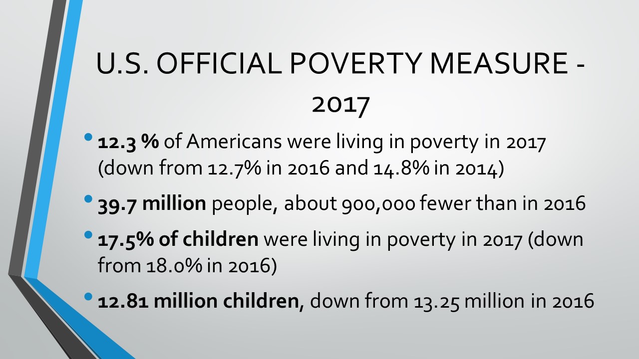
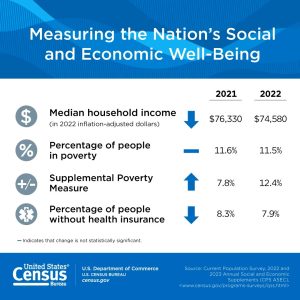
In 2022, the official poverty rate in the US was 11.5%, representing about 37.9 million people living in poverty. The good news is this wasn’t significantly different from 2021; the bad news is that this rate is far too high and still slightly higher than in 2019, before the pandemic.
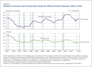
Number of people in poverty and poverty rate over time in the US (US Census Bureau)
One thing to note in the data is geographic differences in poverty. While people living in every type of setting – city, suburb, rural– face vulnerability to poverty, the highest rate of poverty in the US is found “outside metropolitan statistical areas” or, in other words, rural areas. Fifteen percent of people living in rural areas in 2022 experienced poverty, compared to 11.0% living in urban centers (“metropolitan statistical areas.”) In principal cities themselves, poverty remained above 14% for 2022. So, the picture of poverty in the US as being primarily urban is not quite borne out by research; rural areas actually experience poverty at a slightly higher rate.
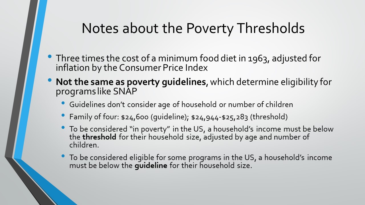
In addition to the official poverty measure, the US Census Bureau also calculates a Supplemental Poverty Measure (SPM.) You can read more about the differences here, but one of the interesting things the SPM lets us see is how certain safety net programs and benefits help alleviate poverty. It also allows us to estimate how much certain costs contribute to poverty. Moreover, it determines the threshold of income that is “in poverty” a bit differently.
One important caveat before getting into the numbers: the numbers below are from the Supplemental Poverty Measure, not the official poverty measure. While they are illuminating and help us to analyze poverty more deeply, they should not be used as a replacement for the official poverty measure.
Here is where the news gets a bit frustrating, to be honest. We knew when the Child Tax Credit was expanded that we would see a rapid reduction in child poverty, and we did. Of course, that expansion and COVID-19 stipends expired in 2022, so the rate of child poverty in the US went up, as we knew it would. In fact, between 2021 and 2022, according to the SPM, child poverty more than doubled, from 5.4% in 2021 to 12.4% in 2022. At the same time, the official poverty rate for children stayed relatively stable, showing the deep impact the Child Tax Credit expansion had on child poverty. Perhaps even more worrisome is that the share of children in households with income of less than half of the poverty line also doubled, showing an increase of more than 100% for children living in what is considered deep poverty. Increases in deep poverty were true across the board for all age groups. The share of the population with resources below 50 percent of the SPM poverty threshold increased for every age group in the US. What this may point to is the way in which tax credits and stimulus payments had had a particularly significant impact on people living in deep poverty. What it also suggests is that ending poverty for households, even households in deep poverty, is not impossible; progress just takes bold but doable policy choices.
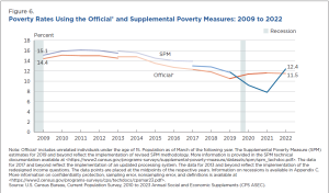
Child poverty – supplemental poverty measure vs. official poverty measure, US (US Census Bureau)
From the SPM, we can also get an idea of how effective certain public programs were in keeping people out of poverty in 2022. As the graph below indicates, for example, the Supplemental Nutrition Assistance Program (SNAP; formerly food stamps) and the National School Lunch Program lifted 5.1 million people out of poverty, while out-of-pocket medical expenses moved 7.1 million people into poverty, which means that, after medical expenses are subtracted from their resources, more than 7 million people had household resources below the poverty line.
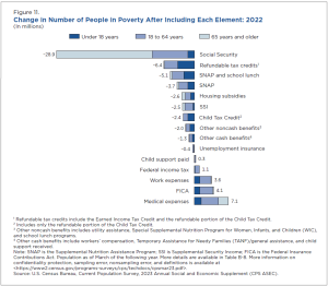
Supplemental poverty measure – the impact of various sources of income or costs (US Census Bureau)
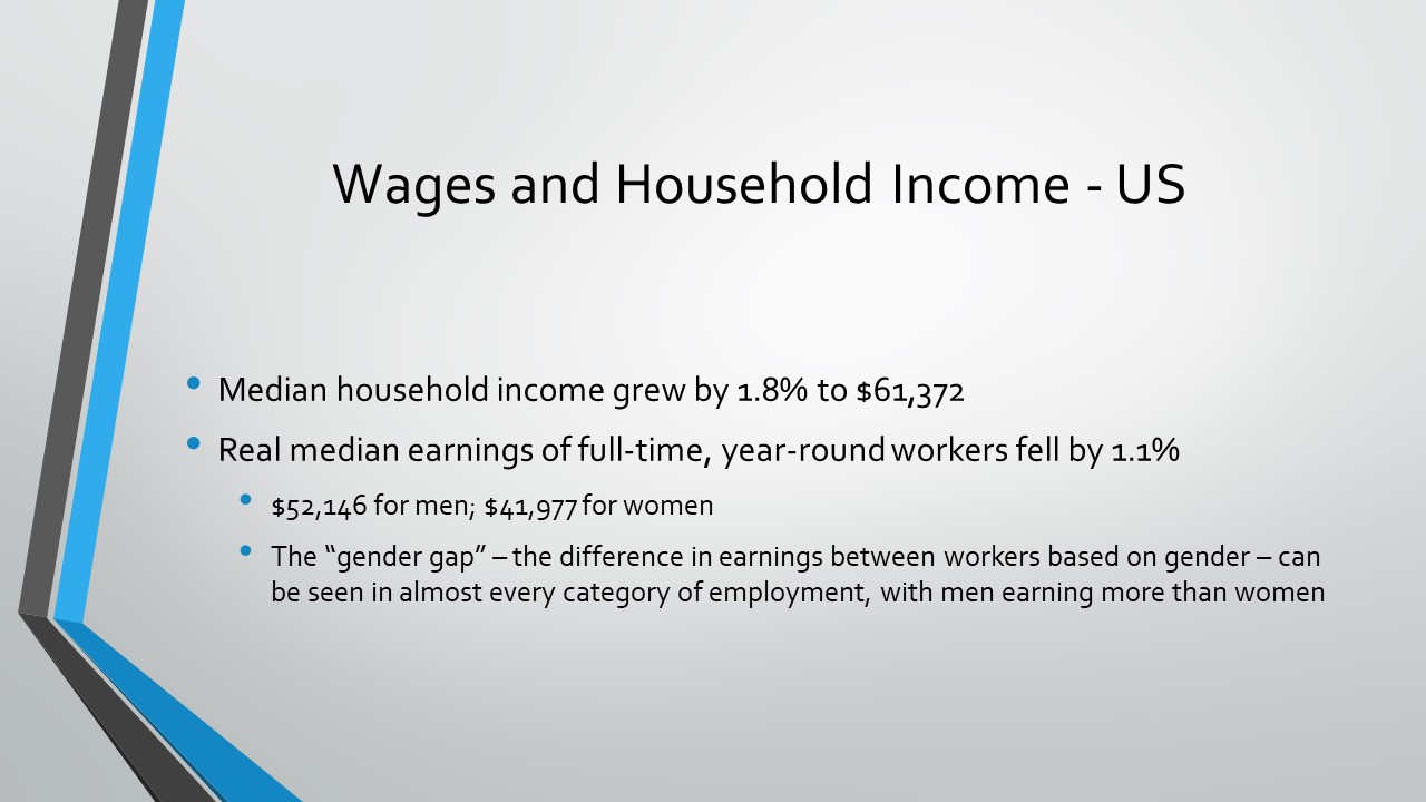
In terms of income, real median household income in the US decreased 2.3% between 2021 and 2022, from an estimated $76,330 per household to $74,580. More people were working full-time, year-round, but real median earnings of workers (including both part-time and full-time) decreased 2.2%. For just full-time, year-round workers, the drop in earnings was 1.3% from 2021 to 2022. So, the next time someone complains about how workers “these days” earn so much, you can gently and gracefully remind them that earnings are lower now than they were last year when accounting for inflation– at the same time (and partially because) goods cost so much more.
Credit: US Census Bureau, 2023
Moreover, the next time someone says, “People just don’t want to work anymore,” it might be helpful to point out that the number of full-time, year-round workers increased 3.4% between 2021 and 2022, compared to an overall increase in workers of 1.7%, which, according to the US Census Bureau, suggests that what we are actually seeing is a shift from part-time work to full-time, year-round work. The percentage of people 16 years and older who were in the labor force in 2022 was 63.5% – not much different from the 63.6% 5-year average from 2017-2021.
In terms of racial disparities in real median income, White and non-Hispanic White households experienced a decrease of 3.5% and 3.6%, respectively, while the change in income for other racial groups was not statistically different from 2021. This change may be because of long-term income disparities. White and non-Hispanic White workers tend to be paid disproportionately higher incomes than other racial groups, sometimes as much as 25-100% higher, and still, despite the modest decrease, get paid real median incomes of $108,700 per year per household, the highest among racial groups. Further analysis shows that the losses in real median income nationwide largely occurred in middle and high income brackets, so this makes some sense.
This drop in middle and high incomes means that income inequality was lower in 2022 than in 2021. In fact, the US Census Bureau reports that 2022 represented the first drop in the Gini coefficient – a common measure of income inequality – since 2007. There is some good news there, though, if we look at other measurements, such as the mean logarithmic deviation of income, which is a bit more sensitive to changes at the lower end of the income spectrum, we still see income inequality at the highest rate it has been since 1967, with the exception of 2021, of course.
What this means is that, yes, income inequality decreased because of drops in income at the middle- and high-income levels. But when the lowest 20% of income earners draw in only 3% of the total income of the country, and the highest 20% get more than 52% of the total income, can we really say that we are making headway on inequality? Probably not. There’s more work to be done.
Where to go from here?
“More work to be done” is a good way to sum up what we can learn from the data. Certainly, we are nowhere near the worst of projections from the early months of the pandemic. But we are also a far cry from the Sustainable Development Goal of ending hunger by 2050.
We know, though, that things do not have to be this way. We have come a long way from where we were as a country and a world in 1974, when the Lutheran hunger appeals that became ELCA World Hunger began. As we look ahead to the 50th anniversary of this ministry next year, we do so with hope and faith. Hunger and poverty are not givens. What the last few years’ worth of data demonstrate isn’t the intractability of hunger but the risk our world runs when we collectively ease up on progress toward ending hunger and poverty.
Working together, learning from one another, listening to each other, advocating together and creating spaces for communities to build trust and address the injustices that create vulnerability will all be important steps along the way.
[1] What makes data “reliable and useful”? One of the first things to consider is whether the sources of data describe their methods, including limitations of the data. This can help point to whether the data are reliable or not. Another factor to consider is consistency. The agencies named in the list use the same methods year after year, so data can be compared over time, and they report any changes to methods that might impact comparability.
[2] In the past few years, there has been more attention to “food crises” around the world and reports that use a measurement referred to as IPC/CH to determine risk of famine. The FAO has a great explanation of how food crisis measurements compare to undernourishment and food security measurements in the 2023 “State of Food Security” report. See Box 1, page 12 of the report.